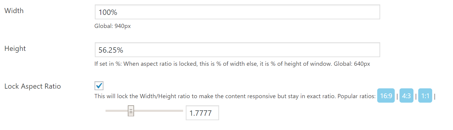
To provide you extra control over content launch and preview, we added Responsive Settings. These settings will help you in setting height and width of the content and locking the aspect ratio for better user experience.
It already has 3 most common aspect ratio buttons, you can use them as per need. If you want to set a custom height and width you can use percentage or pixel values of your choice.
Learn More: Responsive Content Settings
Recommended settings for different types of contents:
1. Responsive Content – Videos
1. Lock Aspect Ratio: Checked. (clicking 16:9 will automatically set height based on width.)
2. Width: 100%
3. Height: 56.25%
2. Fluid Content – Articulate Rise 360
1. Lock Aspect Ratio: Checked. (clicking 1:1 will automatically set height based on width.)
2. Width: 100%
3. Height: 100%
3. Non Responsive Content – Articulate Storyline 2
1. Lock Aspect Ratio: Unchecked.
2. Width: 960px
3. Height: 640px